From rough concept to a product 100K users love.
End-to-end product and web design for a health and fitness start-up, from early concept to a polished, launched product.

The project
A bold idea: rewarding people for moving.
Paace rewards users for staying active, through personal goals, group missions and challenges with friends and family. The early designs showed the vision but needed a complete rethink to match the ambition. As sole designer, working directly with the two founders, I took it from rough concept to a credible, polished product ready to launch.
Client
Industry
Services
Timeline
Tools
The challenge
A big idea, held back by its first design.
Paace’s early designs proved the concept, but they were busy and hard to follow. To win users and keep them coming back, the app had to make moving feel simple, social and rewarding from the very first screen.
Make it instantly clear
Users had to see their progress and rewards at a glance.
Make it social
Friends, family and groups had to be part of every day, not buried in menus.
Keep them coming back
Missions and challenges had to feel motivating, not like homework.
Launch, then keep improving
Get live fast, then iterate in weekly and two-weekly sprints.
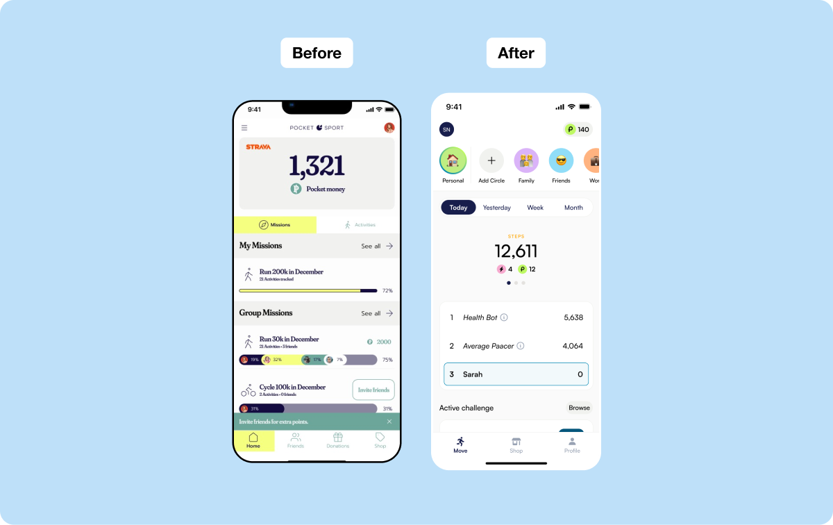
From busy concept to a clear daily habit.
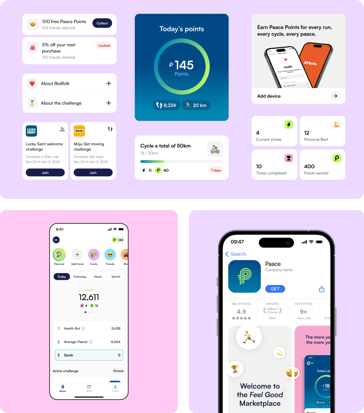
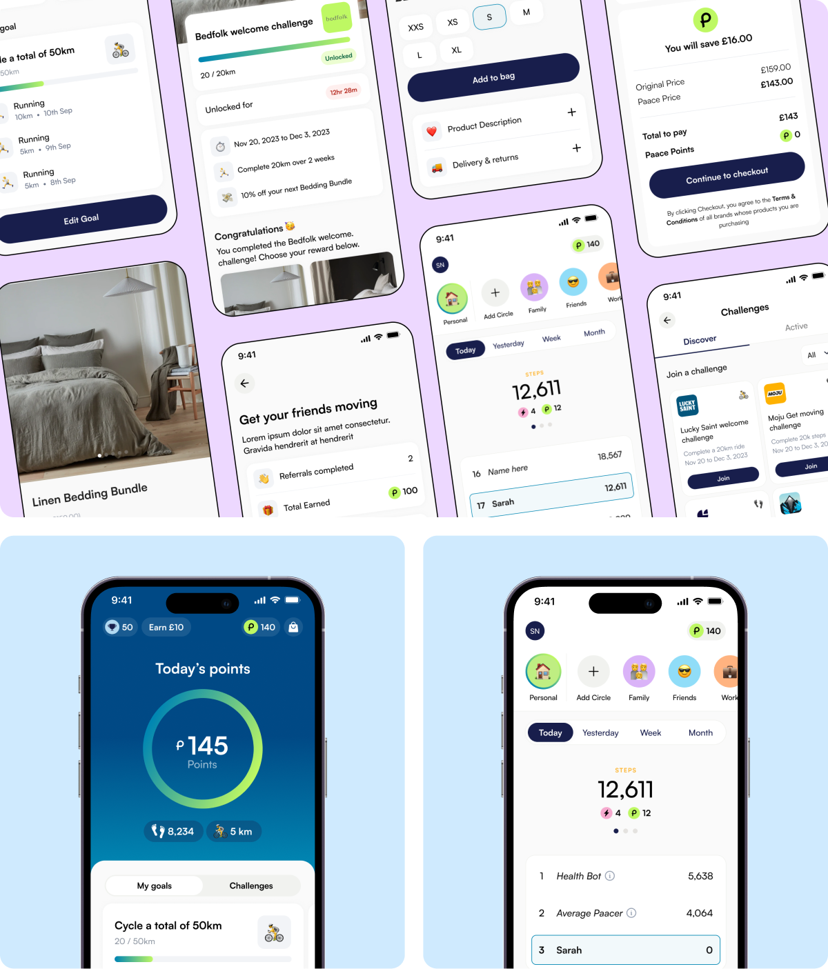
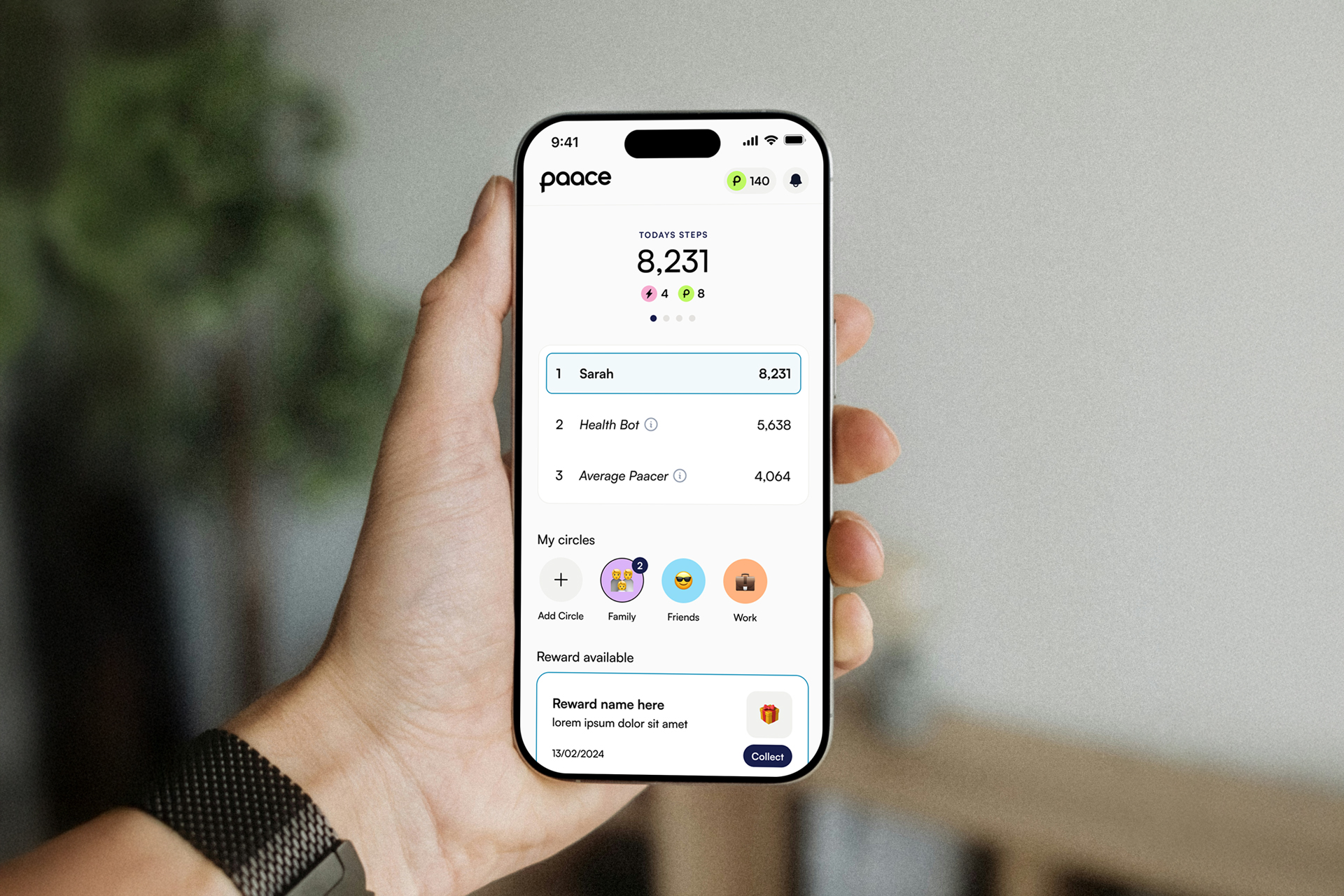
The early design crammed points, missions and group progress onto one screen. I rebuilt it around today’s steps, with circles for friends and family and a simple leaderboard, so the reward for moving is the first thing users see.
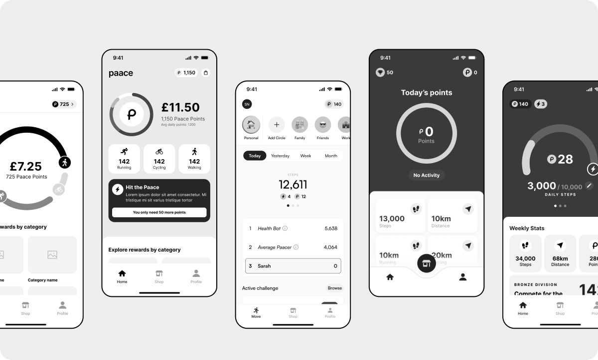
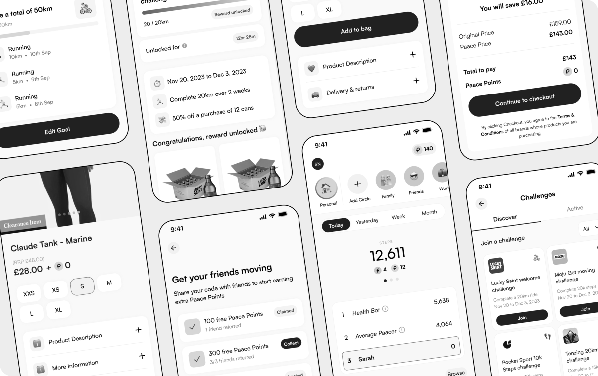
Every step earns something.
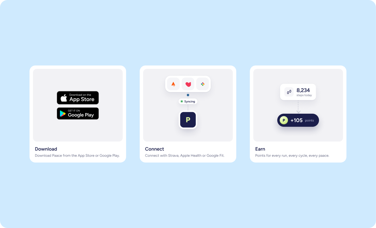
I designed a full system around one loop: move, earn Paace Points, spend them. Brand challenges, streaks and referral rewards keep users motivated, devices like Strava sync activity automatically, and the Feel Good Marketplace lets people spend their points on real discounts.
A website that gets people into the app.
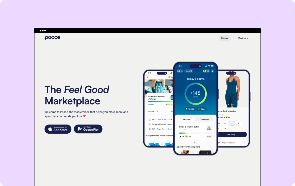
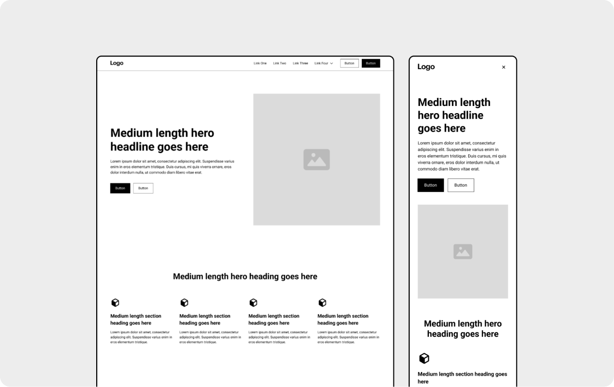
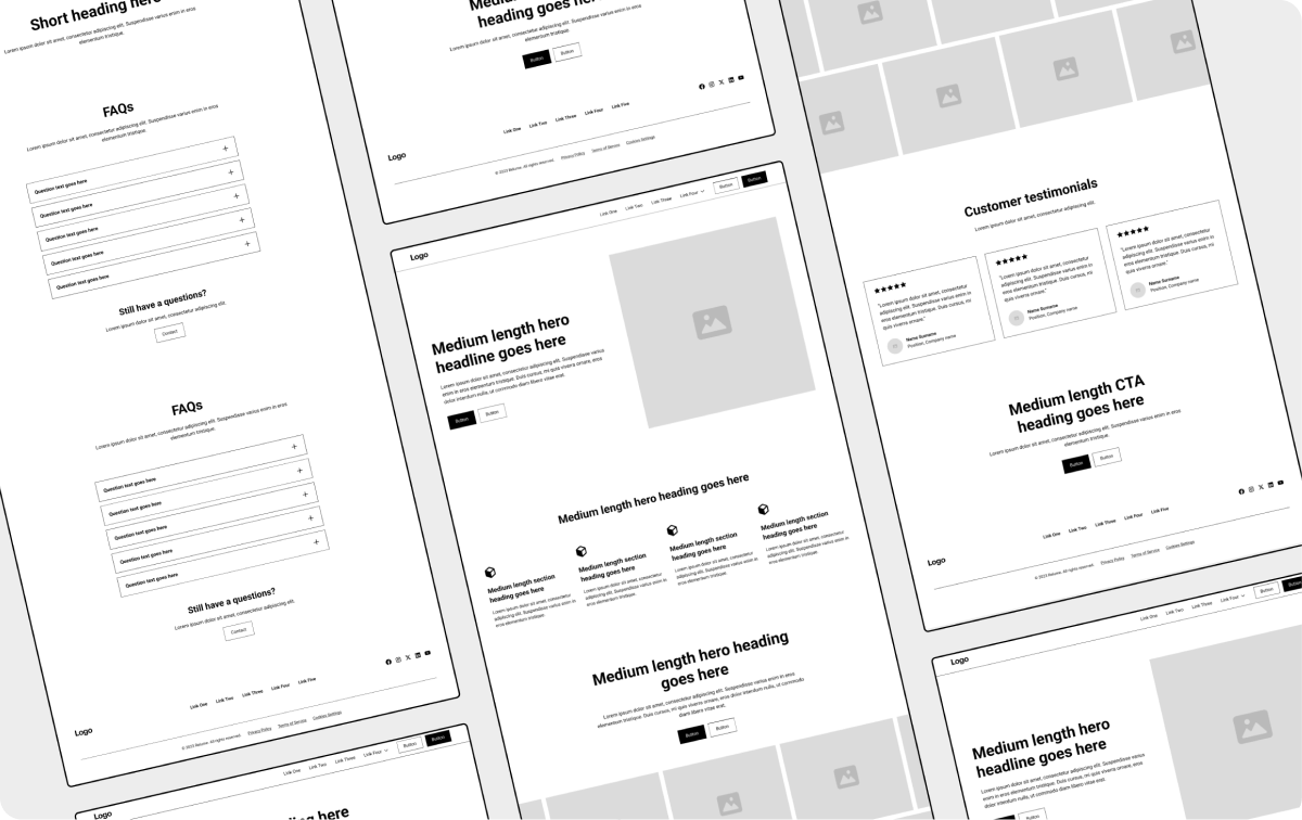
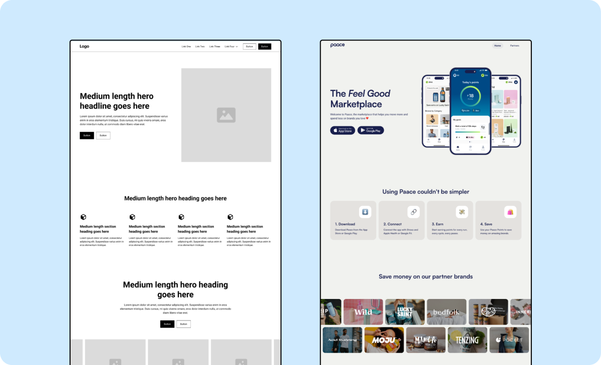
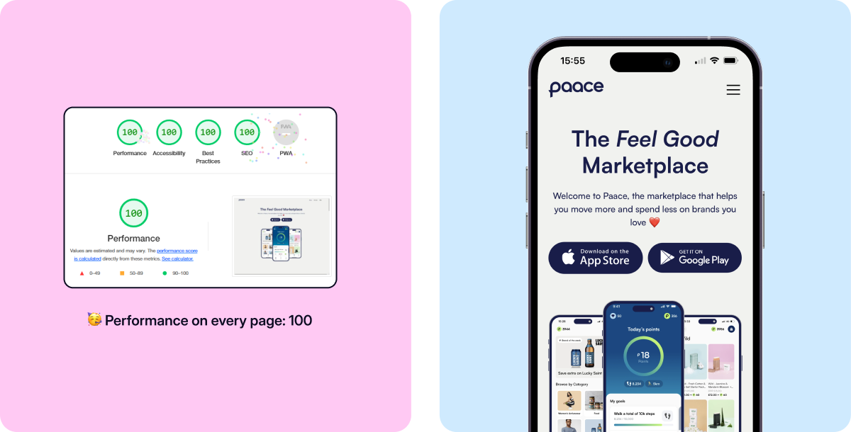
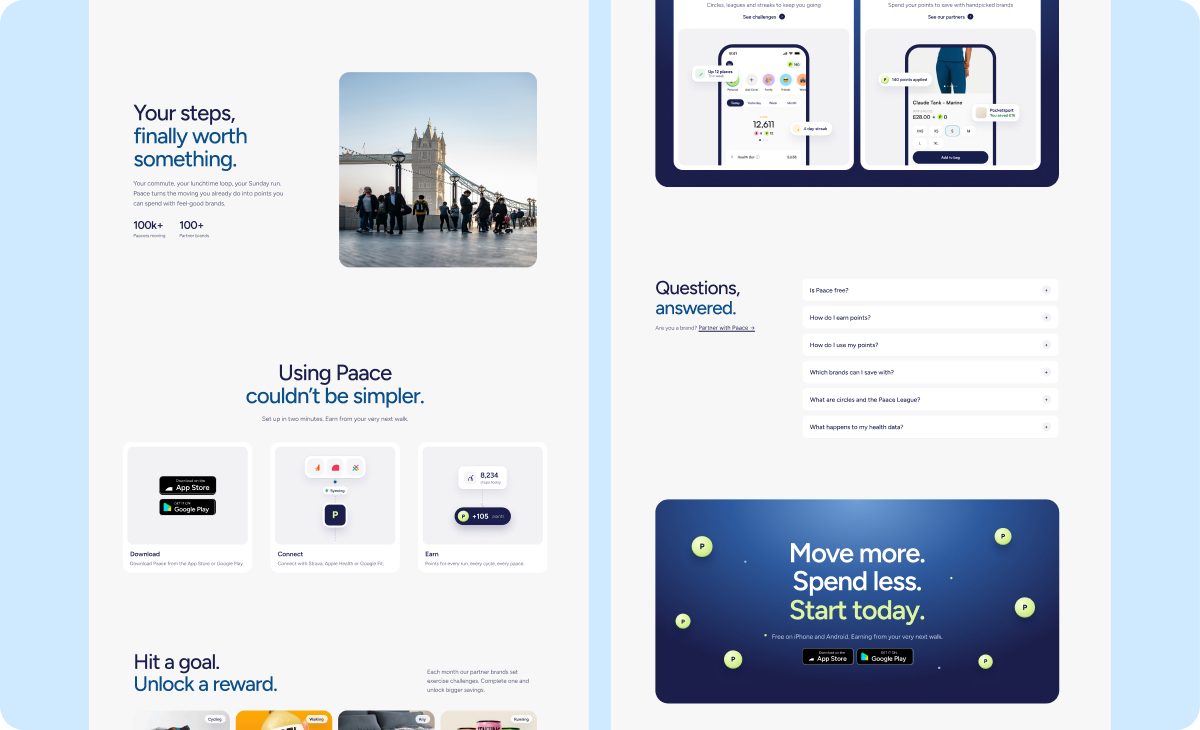
The marketing site had one job: get people downloading. It leads with the Feel Good Marketplace and the real app in action (points, challenges and rewards), with App Store and Google Play buttons right in the hero. I wireframed it first, then designed and built it in Webflow.
Where I’d take the website next.
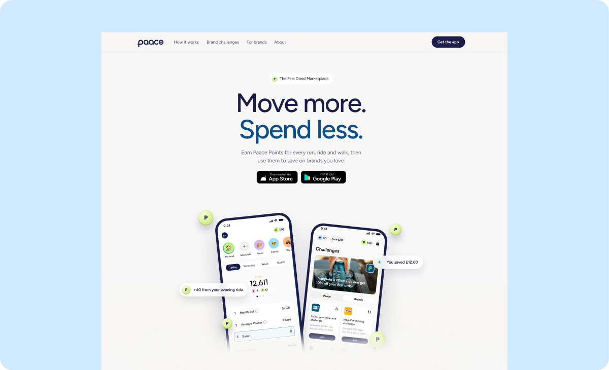
Paace needed a quick, better website to launch with, so that’s what I delivered. I felt it could go further, so in my own time I explored a sharper version: one line that sums up the product, “Move more. Spend less.”, a simple three-step “how it works”, and real proof like the user numbers, so visitors get Paace in seconds.
More case studies
Ready to start your next project?
Whether it’s a new project or extra design support for your team, I’d love to hear what you’re working on.